Data Communication
Effective and equitable communication of the information we have gleaned from our data analyses and visualization involves strategic consideration of the audience and the mode of dissemination that most effectively conveys that information. There are many ways to communicate information, including briefs, interactive documents, websites, dashboards, social media content, data walks, posters, briefs, and infographics. Regardless of the form, content should integrate the recommendations below.
Great communication tools are user-centered and tell a compelling story that connects with the audience.
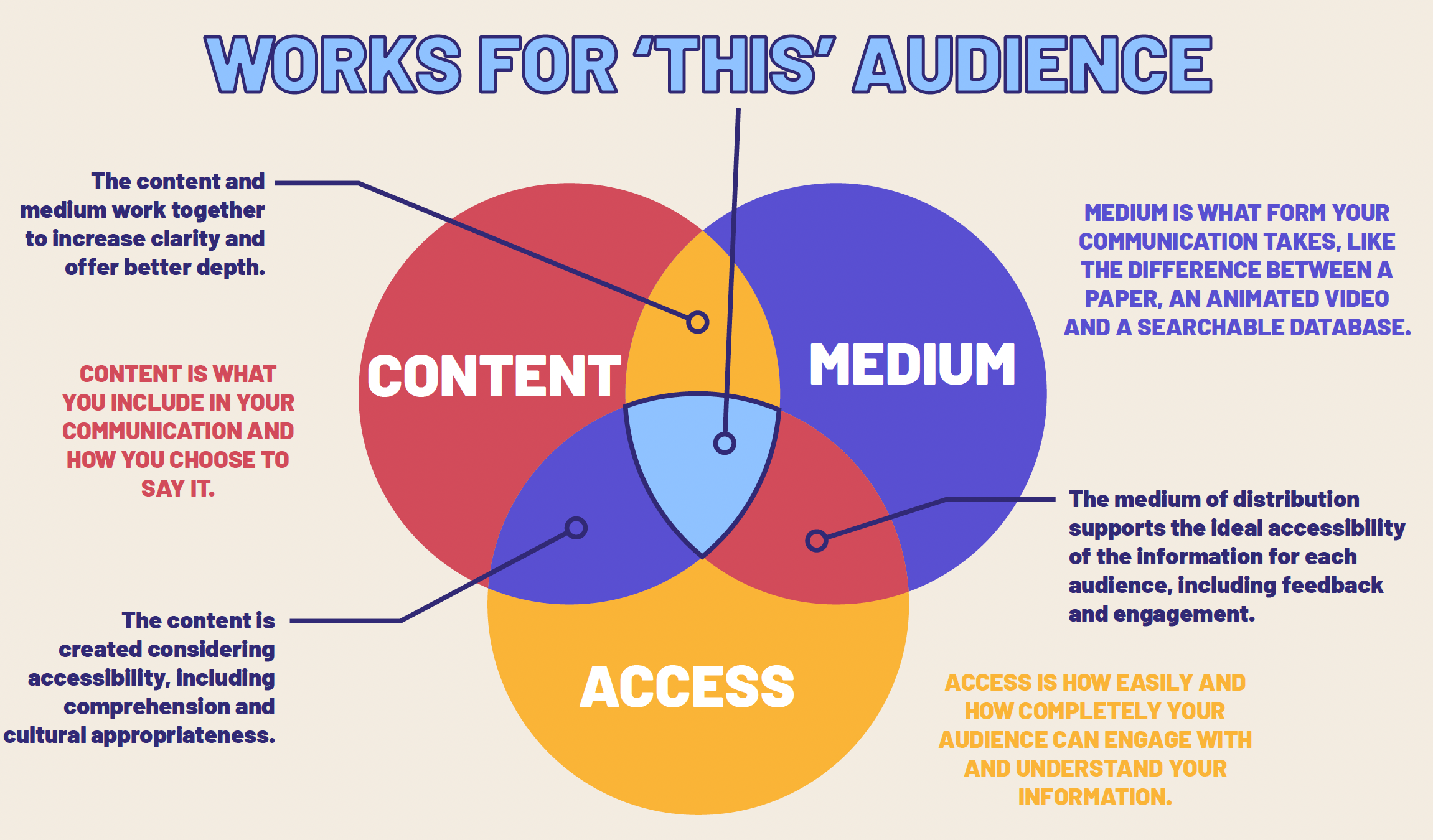
When it comes to communicating about your data or data products with an equity lens, it boils down to making decisions that consider equity and inclusion in the way results are shown and communicated, and that promote accessibility of the data, information, and tool as a whole. As you develop your data communication products - be sure to keep the below considerations in mind and make data, communication, and design choices that support the advancement of equity, inclusion, and justice.
Take a user-centered design approach
Consider who the audience will be for the product you’re developing and make decisions that will prioritize their needs so they are able to easily and efficiently use, engage and interact with the product.
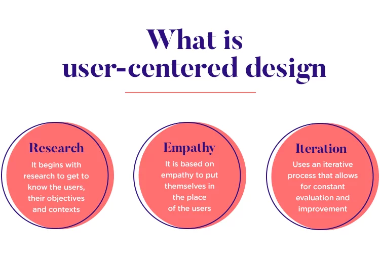
Research - Let’s use an equity lens here. Instead of “researching” your users and audience, try getting to know them by prioritizing relationship and trust building through meaningful engagement. Ideally, by the time you’re at this data communication phase, you have already identified the audience and key partners, and have been working or engaging with them during other phases of the project. See the Planning section on collecting expert input for more guidance on outreach and engagement.
Empathy - According to Dr. Brené Brown: empathy is about feeling WITH people, and requires four qualities:
- Perspective taking and believing the other person when they share their experience with you
- Staying out of judgement and listening
- Recognizing emotion in another person that you have maybe felt before
- Communicating that you can recognize that emotion
Integrating empathy into our data-intensive work requires us to consider how our audience and/or the communities whose data are being used will perceive or be impacted by our work. It means ensuring we’re developing the product and thinking about the data as more than mere points on a map or visualization, but as representing real humans, environments, and conditions that should be contextualized, considered, and communicated about with care. Some questions to consider include:
- Who is vulnerable in this context and how would they want to be counted?
- What information would they need to improve their lives?
- Who is undercounted or possibly missing entirely?
- Who was counted? Who did the counting? Why were they asking these people?
- Who benefits or is harmed if you forget the dots are people?
Iteration - The key here is knowing and planning for an iterative process from the beginning. Add the feedback, implementation, and testing loop(s) into your project plan and allocate appropriate time and resources to adequately support each step. When working with partners or communities using an iterative approach, be sure to consider:
- When it is appropriate to ask for feedback, and when it might be burdensome?
- What are the different ways feedback might be gathered? We might think sending an email with a poll or survey linked is the easiest, but our partner might find it easier to talk through questions over the phone with you. Knowing which method(s) to use comes with time and relationship. When in doubt - ask for what people prefer and do your best to accommodate those needs.
- How much time is adequate for folks to be able to review what you send them and provide their feedback? When in doubt - plan for a longer feedback period than you think might be needed and confirm timelines with your partners (and adjust them if you can when your partners indicate more or less time is needed)
Use plain, accessible, and inclusive language
Centering racial equity means paying attention to how to most effectively convey information to the audience, and ensuring that the content is using plain, accessible, and inclusive language.
Plain Language - Plain language is writing designed to ensure the audience can understand what you’re trying to communicate as easily, quickly, and comprehensively as possible. This means:
- Avoiding convoluted or verbose language
- Avoiding the use of jargon and acronyms
- Making critical information easy to see and understand
- Using a conversational rather than legal or bureaucratic tone
For more guidance on plain language, see:
- Center for Plain Language
- PlainLanguage.gov
- Water Boards Staff may also request plain language review from the Office of Public Participation, although that service is more geared towards the review of fact sheets, brochures, and FAQs rather than data visualizations or other data products at this time.
- Healthy Watershed Partnership Guidance on Communicating Results
Accessible Language - Making language accessible to your audience may also require the translation of products (or product components) into the primary languages used by your audience. The Water Board’s Linguistic Isolation Tool can be used to help understand the different languages that are used by communities across the state.
Water Boards Staff may also request translation services from the Office of Public Participation, although that service is more geared towards the translation of documents, rather than data visualizations or other data products at this time.
Inclusive Language - Words matter. The language we use in our products can be a way for us to show respect, empathy, and care for the communities connected to or impacted by the data. It’s important to be mindful of the language and terms we use (see Non-Inclusive Terms to Avoid for examples). The UNC Health’s Equity and Inclusion Analytics Workgroup recommends we ask ourselves the following questions when we need to decide on language to use in our data products:
Do the words seek to fix, blame, shame, or change communities that are most marginalized, OR do they seek to address the oppressive systems that impact these communities?
Are the words racialized? Do the terms have a racist or colonialist implication? An example is the phrase “at risk.” Close your eyes and say the phrase “at risk.” Does a picture of a certain group or community come to mind? If so, stop and pick another word.
How am I framing the words? What is the context and culture we are creating and perpetuating by using the words? Are the words positioning the communities we serve to live in their personal and collective power while addressing systemic oppression?
Do the words dehumanize the communities we serve? Words that take away agency, self-determination, or personal power and do not recognize communities’ inherent strengths and assets should be avoided.
Tell a story
“While data may seem cut and dry, people are not”
- P. Kim Bui, Director of audience innovation at the Arizona Republic and author of Designing data visualisations with empathy
Humans are hardwired for story. Plopping points on a map or throwing together an interactive chart without adding context is not only insufficient, its ineffective!
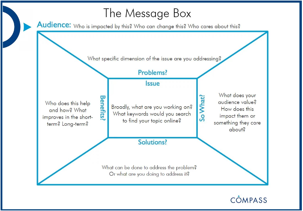
Take the time to tell a story with the data product you’re developing. Walk the audience through the messages you want to convey - connect with their emotions, and back it up with the data. If you’re unsure what the story of your data is, or how to communicate it effectively, try collecting and distilling your thoughts using a COMPASS Message Box:
Escape from the Ivory Tower: A Guide to Making Your Science Matter (Baron, 2010) is another great science communication resource.