Data Processing
“Raw data, like raw potatoes, usually require cleaning before use.”
— Ronald A. Thisted, Professor Emeritus - Departments of Statistics and Public Health Sciences, The University of Chicago
“Tidy datasets are all alike, but every messy dataset is messy in its own way.”
— Hadley Wickham, Chief Scientist at Posit (formerly RStudio)
Good data organization and formatting is the foundation of any data project. Once the data are collected, you will need to process them so they can be used in your analyses or product development steps.
It’s commonly understood in the data science field that 80% of data analysis is spent on the process of cleaning and preparing the data (Dasu and Johnson 2003) - expect the same will be true for your project and prepare to invest time and resources accordingly.
The Resources section below links to resources that provide detailed technical guidance on how to process data using data science methods. Here, we discuss the why and how we go about this step with an equity lens.
When we talk about data processing here, we’re referring to the steps required to organize, format, and clean the data so it’s more efficient to use in future steps, and so others can consistently reproduce your steps. Common data processing steps and considerations using an equity lens are provided below.
Keep your “raw data raw”
It’s important to keep (and back up) a version of your data that is untouched by your process (i.e. raw). We also recommend backing up a version of your data that is tidied and cleaned (i.e. what you will use for analysis). Not only does doing so protect you if your working version of the data are lost for some reason (e.g., computer crash, freak system failure) - but it also helps with reproducibility and transparency of your process.
Remove duplicate or irrelevant data
When you’re processing your data and making it tidy, think through which data from your sources are applicable to your question(s). Sometimes we don’t have the technical or logistical capacity to keep ALL of the data we are able to collect - so if you are going to remove data at this step, be sure to document WHY you’re removing it in a way that makes it easy for others to easily understand the reasoning behind the data decisions you’re making. Some reasons might include:
Data are outside of the geographic scope of the analysis (e.g. we’re focused on a particular region for the project, and we are removing data outside of that region so we can increase loading/analysis speeds)
Fields/columns from source data are not relevant to our analysis for XYZ reasons.
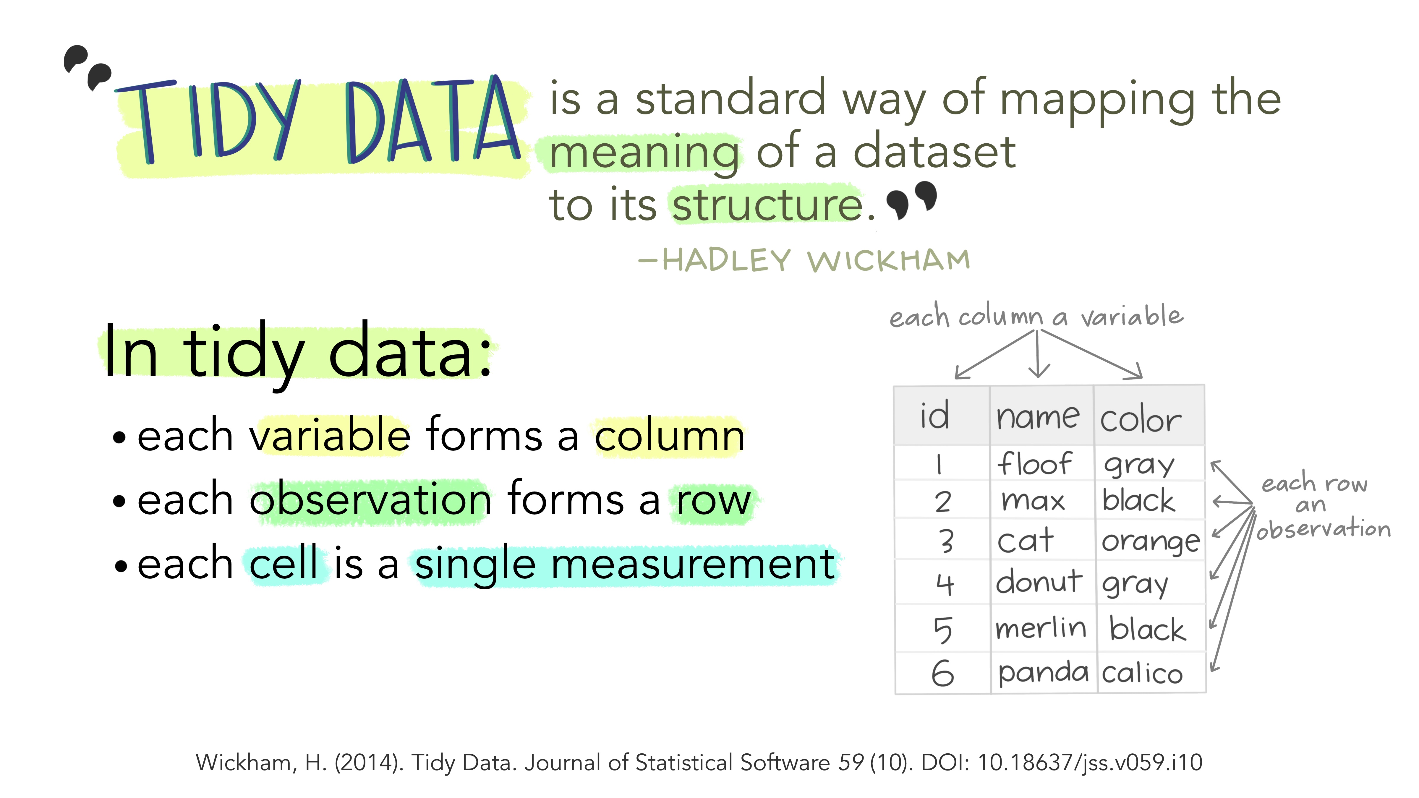
Tidy your data
Here you will reformat or restructure your dataset so it can be used in your future analyses or product development steps in a way that is efficient, effective, and meaningful for your project’s objectives (i.e., commonly referred to as tidying data). A common data transformation at this phase is converting a dataset from wide to long formats.
From a data science lens - Investing the time to properly tidy your data upfront makes the analyses or product development steps much more efficient and reproducible. This will cut down the time it takes in the long term to complete your analysis and product development steps (even if they need to evolve/change over time!), enabling you to spend more time on the actual data, science, management, and equity questions you have for your project (aka the good stuff!).
From an equity lens - having consistent and reproducible data makes it easy for others to replicate your work, which can increase transparency of your process and ultimately help build trust with your partners, the communities impacted by the management decisions associated with your project, and the public at large.
Additionally, working from a foundation of tidy data (and using consistent tools) can make it easier for others to collaborate with and contribute to your data project, which generally results in a better product in the end.
Explore your data
Once duplicate and irrelevant data are removed from the dataset, you may want to explore your data using simple visualizations or statistics (see the Data Exploration Checklist for ideas). This will help you find extreme outliers in your data, or otherwise incorrect or missing data that should be removed, separated, corrected, substituted or imputed before you begin your data analysis phase. Similar to when you removed duplicate or irrelevant data, you will want to document WHY you’re removing/correcting/imputing these data in a way that makes it easy for others to easily understand the reasoning behind the data decisions you’re making.
Any aggregation or analysis of your data should be completed during the analysis phase of the project. Keeping the values and aggregation of the data as they are at this phase increases reproducibility and transparency now and during future steps. Note that this is different from transforming data as described above (e.g. restructuring from wide to long format), which is a common and very useful part of the data processing phase.
You might be tempted to begin your data quality assessments as you’re looking at the data during this phase, but you’ll actually want to hold off on that for now. You’ll complete your data quality and assurance steps after all of your data have been tidied and you can look at all of your data holistically.
Consider how you will group the data
Now that you are more familiar with your data, it’s a good time to start thinking through how the data you are collecting is already grouped and how you intend on grouping the data in future phases of your project. You may not be able to decide on how you will ultimately aggregate or disaggregate the data until you are further along in the analysis or visualization stages - but it’s important to begin thinking about this issue during the data collection phase for the reasons outlined below.
How we aggregate or disaggregate the data can impact which groups are “seen” and represented (or not) in our data products. This can also influence who is centered, valued, or prioritized in the narrative of the visualization, and who is excluded.
Carefully consider how groups are lumped or split - by aggregating many groups in the visualization beyond what might be statistically necessary (and not acknowledging who is being grouped together and why), we can unintentionally misrepresent said groups, minimize inequities and perpetuate invisible and erased experiences of those communities. On the other hand, when analysts create a subgroup, they may be shifting the focus of analysis to a specific population that is likely already over-surveilled (Centering Racial Equity Throughout Data Integration). Also note that whatever grouping or splitting decisions you make may have statistical implications that may need to be considered and accounted for.
The UNC Health’s Equity and Inclusion Analytics Workgroup recommends we ask ourselves the following questions when we’re thinking about how we will aggregate the data (or not):
Is important data/nuance lost by combining categories? Ensure there is not a meaningful difference in our ability to understand equity outcomes between groups that would be lost if combined.
Does the inclusion of uncombined data negatively impact the interpretation of the data visualization? Having too many groups can make visualizations cluttered and hard to interpret. Additionally, disaggregation leads to smaller group sizes, which can make comparisons to larger groups more difficult and quantifying statistical significance more challenging. For those reasons, it can sometimes be best to combine groups.
Does sharing uncombined data compromise confidential information (e.g., Personal Identifiable Information) or information considered private by the community from which it comes (e.g., locations of sacred practices)? This will depend on the audience you are sharing the visualization with (e.g. internal vs public) and what information it contains.
If you ultimately decide to aggregate / combine groups, be sure to:
Avoid creating a dichotomy of races. Don’t use “White” vs. “non-White” or “people of color.” Rather, disaggregate the “non-White” group to show the diversity among communities.
Be transparent about why you’re making those decisions (including the trade offs you considered) and documenting those decisions accordingly.
Acknowledge who is now not included in the data or visualization and explain what groups have been combined and why. Use comments, tooltips, or footnotes that can be easily accessed within the visualization to make it easier for users to find this information.
Think carefully about how groups are lumped in the “other” category of our analysis or visualization. Sometimes it’s necessary to combine groups into a single “other” category (e.g. to generalize small groups to protect confidentiality or to achieve adequate sample size for your analysis). The Urban Institute’s Do No Harm Data Visualization Recommendations include considering alternatives to using the term “other” as a catch-all category, including:
- Another ______ (e.g., Another race or Another group)
- Additional ______ (e.g., Additional races or Additional languages)
- All other self-descriptions
- People identifying as other or multiple races
- Identity not listed
- Identity not listed in the survey or dataset
Additional Resources
- College of Water Informatics Data Management Handbook - Collect and Process Section
- Julia Lowndes and Allison Horst (2020) Tidy Data for reproducibility, efficiency, and collaboration. Openscapes blog.
- Hadley Wickham. Tidy Data. Journal of Statistical Software
- Hadley Wickham, Mine Çetinkaya-Rundel, and Garrett Grolemund. R for Data Science (2e) - Data Tidying Chapter
- The Py4DS Community. Python for Data Science - Tidy Data Chapter
- Karl W. Broman, and Kara H Woo (2018) Data Organization in Spreadsheets. The American Statistician 72 (1). Available open access as a PeerJ preprint.