Data Collection
You should have addressed this during the Plan & Prepare phase of your process…but just in case you haven’t (yet) or you need a refresher - we’re restating here:
Achieving racial equity outcomes means that race can no longer be used to predict life outcomes and outcomes for all groups are improved (Glossary)
So, as you begin to collect the data for your project, be sure it includes:
Data that can represent your management question(s) or project objectives.
Data that can tell us something about the extent to which we are achieving equity outcomes. This may be limited to simple demographic data - but it could also be something more! Working with Tribal and community experts to decide what type(s) of data are most applicable to and reflective of their lived experiences as they relate to your management questions and project objectives is a great place to start!
The data related to your project may come from direct human observation, laboratory and field instruments, experiments, simulations, surveys, and/or compilations of data from other sources. Below we focus on data that can be downloaded from open data sources, and survey guidance.
Data Limitations
As you begin to collect the data required for your project, it’s important to remember that ALL data have limits in what they can actually tell us, constraints on how they should be used appropriately, and biases related to initial data collection or generation - and it’s crucial to be aware of and account for them during your project.
In addition to data limitations related to data quality or analysis methods (e.g., insufficient quality, low sample size, data gaps; see the Quality Assurance and Data Analysis pages for more details), be sure to also keep the below considerations in mind so that you can prepare and analyze your data in a way that supports the advancement of equity, inclusion, and justice.
It’s OK to have some data gaps, and in the case of conducting data analyses with a racial equity lens, gaps will be the norm. What’s important is to acknowledge what gaps exist, document how you will account for them, and (ideally) set a course for filling those gaps, as appropriate.
Unconscious bias of data sources
We all have unconscious biases and operate in inequitable and unjust systems. That can unconsciously and unintentionally impact how data are collected and result in datasets that reflect those biases. Knowing what biases may be in play in your work is helpful to success. You cannot remove them completely!
Take time to ask the following questions about the data you’re interested in using for your project so you can have a better understanding of the data’s context and be better able to detect and account for potential biases of said data:
- Who funded the study / collection of the data?
- Who collected the data?
- Why were these specific data collected? What were the data collection goals?
- How was data collected?
- What was prioritized during data collection?
- What assumptions were made during data collection?
Who is missing from the data
It’s not uncommon for project teams to have gaps in data, even after all of your diligent work and investment into the planning and data preparation steps of the project. This limitation of the data may be out of your control - especially when you are using data from external sources. Quality data regarding marginalized communities is often lacking. For example, recent research has shown that US lakes are monitored disproportionately less in communities of color - similar trends may be likely in other data sources.
When this happens, it’s important to acknowledge, document, and accessibly communicate those gaps and who is not adequately represented in your data product. In some cases, it may be appropriate to still present or analyze these data, while also presenting caveats for the data limitations. In other cases, it may be more appropriate to rely only on qualitative discussion based on information derived from background research and feedback from affected communities.
Common Data Sources
In most cases, the Water Boards programs were not developed or designed to collect the types of data needed to conduct analyses with an equity lens as a matter of process which means that most will rely on external data sources. Below we have provided a list of common data sources that can tell us something about the extent to which we are achieving equity outcomes.
Demographic Data
Adding demographic data to your data project can help increase understanding of potential correlations or relationships between your data and demographic and socioeconomic characteristics of locations of interest. More specifically, the integration of demographic data into your data project can highlight the extent to which race can still be used to predict outcomes associated with your project and therefore underscore where and to what extent racial equity outcomes have not yet been achieved.
Demographic Data Needs Context
It’s important to remember to provide context about your project before trying to communicate demographic related results or answers to specific racial equity questions posed by our Board, the public, or our partners in this work. Contextual topics could include:
- What is your program/project about? What is the mission?
- What is your program/project meant to do? What are your objectives/goals?
- How well does your program/project do these things now (aka Performance Report)?
- What approaches are you taking with this project to advance equity outcomes?
- What equity and data related questions do you have for your program/project? Which data types and datasets would be the best to use to answer that questions?
Communicating this contextual information may require different complementary modes of communication (e.g. presentation, fact sheets, visualizations), but investing the time to provide that grounding and framing will help the audience understand how you are approaching your data work with an equity lens within the scope of your program/project.
Be sure to reference, pull from, and build on information you have already synthesized in your Equity Assessment and Data Management Plan documents!
Demographic Data Consideration Example
The Safe and Affordable Funding for Equity and Resilience (SAFER) Program developed the Final FY 2024-25 Fund Expenditure Plan for the Safe and Affordable Drinking Water Fund in response to the Senate Bill (SB) 200 (Ch. 120, Stats. 2019) which requires the annual adoption of a Fund Expenditure Plan for the Safe and Affordable Drinking Water Fund.
The SAFER Program’s goal is to provide safe and affordable drinking water in every California community, for every Californian. FY 2024-25 marks the halfway point of the initial ten years of continuously appropriated funding to the Safe and Affordable Drinking Water Fund as originally envisioned in SB 200.
Looking at the SAFER Program goal with an equity lens, we can add that the goal would be for race to no longer predict a person’s ability to have access to safe and affordable drinking water.
The Racial Equity and Environmental Justice Section of the Plan (Section VIII.G.) provides several tables with data that incorporates demographic data. As we see below, presenting demographic data alone does not tell the full story of the issue. The tables and the text lack clarity and in-depth analysis on why the data is telling the story it is.
As you go through the process of collecting demographic data for your project - be sure to understand:
Why demographic data are needed for your project
How you plan on using demographic data, in concert with the other data sources you identified in your Data Management Plan, to tell the (often complex and nuanced) story behind the data.
How you plan on taking action to advance equity based on whatever is shown in the analysis. You might not be able to have a full plan in place at the data collection step - but now is the time to begin brainstorming so that you can take action as swiftly as possible once the analysis or data product is complete.
For this example, race and ethnicity of the populations served by the water systems likely isn’t the only difference between the systems. What other factors are associated with different populations that could be driving the imbalance in failing systems and funding? Perhaps the majority-Hispanic population systems are much larger, or older, or have more severe problems.
A more nuanced comparison would look at the major factors that determine cost (or other metrics driving the imbalance in failing systems and funding) and compare the racial difference between those subgroups. For example, comparing the racial and ethnic differences between systems of medium sized cities with water treatment plants built within the past 30 years.
Some recommendations to improve the storytelling and meaningful impact of the data being shown in the report to support the advancement of equity could include:
making proportions of different populations and their association to failing systems (or other metrics) more explicit
adding a section articulating how the most impacted and burdend population systems (Hispanics in this case) will get more funding, proportionally
list some additional explanatory factors that could be explored in future analyses
Census Data
The data sources many use to make inferences related to demographic and socioeconomic characteristics are from the United States Census Bureau and the associated American Community Survey (ACS) Data.
American Community Survey
The ACS collects data every year and asks about a wide array of topics not included in the Decennial Census, such as education, employment, internet access, and transportation. ACS data are available as 1-year, 3-year, and 5-year estimates, indicating that data was collected over 1, 3, and 5 years, respectively. For example, 2019-2023 ACS 5-year estimates are values for the year 2023 but have collected data from 2019-2023 in order to calculate the values for the year 2023. Estimates with more years of data are more reliable, hence 5-year estimates are the most reliable.
Decennial Census
The Decennial Census is conducted every 10 years. It asks far fewer questions than the ACS. Topics included in the Decennial Census are age, sex, race, Hispanic origin, and owner/renter status. The dataset was last updated in 2020, although there are limitations and potential inaccuracies associated with relying solely on Decennial Census data to enumerate demographic characteristics within a given census tract (e.g, data gaps, inadequate representation). This tool from the Department of Finance exists to measure these limitations.
Census Geographic Data
Census GIS data of geographic boundaries can be downloaded as TIGER/Line files and Shapefiles. This GIS data does not include demographic data but can be joined to demographic data in ArcGIS.
Key Terms
In addition to the terms defined in the Handbook Glossary, users should know the following terms when using demographic data:
Demographics: statistical data relating to characteristics of human populations, such as: age, race, ethnicity, sex, gender, income, education, etc.
Geographic (Geospatial) Vectors: how data are stored in geographic information systems:
Points: zero-dimensional objects that contain only a single coordinate pair (i.e. latitude, longitude) to define their location. Example: Census landmarks
Lines: one-dimensional features composed of multiple, explicitly connected points. Examples: roads, streams
Polygons: two-dimensional features created by multiple lines that loop back to create a “closed” feature. Examples: region, city, county, census tract, block boundaries, lakes
Geographies: the geographic unit(s) into which demographic data are aggregated.
Blocks (Census Blocks or Tabulation Blocks) are statistical areas bounded by visible features, such as streets, roads, streams, and railroad tracks, and by nonvisible boundaries, such as selected property lines and city, township, school district, and county limits and short line-of-sight extensions of streets and roads. Blocks are numbered uniquely with a four-digit census block number from 0000 to 9999 within census tract, which nest within state and county. Note that block-level demographic data is only collected as part of the Decennial Census.
Block Groups are statistical divisions of census tracts, are generally defined to contain between 600 and 3,000 people, and are used to present data and control block numbering. A block group consists of clusters of blocks within the same census tract that have the same first digit of their four-digit census block number.
- Tribal Block Groups are only applicable to legal federally recognized American Indian reservation and off-reservation trust land areas, and are defined independently of the standard county-based block group delineation. Tribal block groups use the letter range A through K (except “I,” which could be confused with a number “1”) to identify and code the tribal block group. Tribal block groups nest within tribal census tracts.
Census Tracts are small, relatively permanent statistical subdivisions of a county or statistically equivalent entity, that generally have a population size between 1,200 and 8,000 people, with an optimum size of 4,000 people. State and county boundaries always are census tract boundaries in the standard census geographic hierarchy.
- Tribal Census Tracts are only applicable to legal federally recognized American Indian reservation and off-reservation trust land areas, are defined independently of the standard county-based census tract delineation, and can cross state and county boundaries. Tribal census tract codes are six characters long with a leading “T” alphabetic character followed by five-digit numeric codes having an implied decimal between the fourth and fifth character.
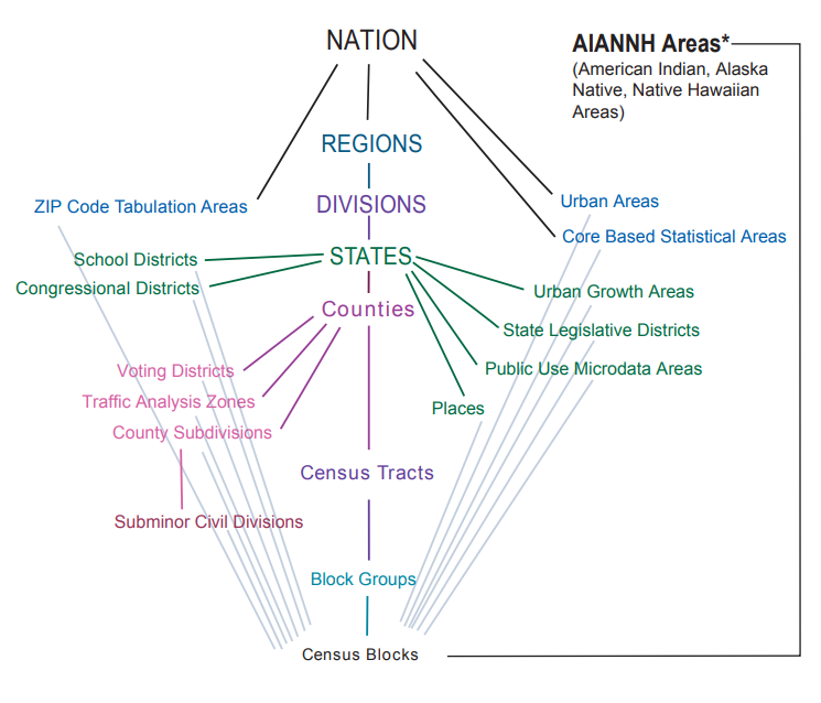
Census Geography Unit Hierarchies
Also see this U.S. Census Glossary for additional terms specific to U.S. Census programs, data, and products.
Data Integration Methods
Depending on what demographic data sources and software you decide to use, the methods needed to combine, overlay, or compare with the data you are interested in may vary. See the Demographics Use Case page for step by step guidance on how to download and compare demographic data to point, line, and polygon data types.
Data are NOT people - We need to use these data to get a better understanding of what’s going on in our communities, but the data (at best) only represent a sample of the community’s population and in no way reflect everyone or their lived experiences.
There’s no such thing as “equity data” - how we use data, interpret it, and act on what we learn makes our use equitable (or not). Simply including demographic data in your project’s analysis or data products does not make those resources equitable - to operationalize equity we need to take actions and make decisions in ways to advance equitable outcomes.
The data you’re using has limitations, be sure you know what they are before moving forward - as discussed above, all data have limitations, and that is particularly true for demographic data. Be sure you have a clear and comprehensive understanding of the limitations that apply to the specific datasets you’re using so you can collect and eventually process and analyze those data in ways that are appropriate.
CalEnviroScreen
CalEnviroScreen is a mapping tool based on lots of data integrations and synthesis work done using peer review and scientific method principles. The overall goal of the tool is to help identify California communities that are most affected by many sources of pollution, and where people are often especially vulnerable to pollution’s effects. CalEnviroScreen can be a helpful tool in creating visualizations and performing analysis as it provides a number of indices, as well as a “rolled-up” score that combines environmental and demographic data together. As with any dataset or visualization tool there can be things to consider, a couple of which are discussed below.
Missing Values for CalEnviroScreen Scores
Users conducting an analysis with the CalEnviroScreen (CES) 4.0 dataset should be aware that it contains missing values, both for individual indicators and overall CES scores. These missing values are distinct from zeros, which are also in the CES dataset.
In the CES 4.0 data (for the version available as of April 2023), the shapefile containing CES 4.0 scores encodes these missing values as negative numbers (-999 for most variables, and -1998 for one variable). The Excel workbook containing CES 4.0 scores encodes these missing values as NA. Also, note that the CalEnviroScreen 3 shapefile (June 2018 update version) encoded missing values as 0, so users should be aware of this change if/when updating an analysis from CES 3 to CES 4.0 data.
Users should account for these missing values – and their different encodings – as needed when doing any analysis using CES data.
For more information about the missing (and zero) values in the CES 4.0 dataset, see the data dictionary (PDF file) that accompanies the CalEnviroScreen 4.0 results Excel workbook, both of which are available for download as a zip file.
Inconsistent Census Tract Boundaries in CalEnviroScreen 4.0 Shapefile
In the CES 4.0 data (for the version available as of April 2023), the shapefile containing CES 4.0 scores uses a simplified version of the polygons that represent 2010 census tracts. The boundaries of the census tracts defined by these simplified polygons do not always align with the boundaries of neighboring census tracts, resulting in slight gaps or overlaps between some neighboring census tracts. These inconsistencies are not likely to have a significant impact on most uses of the CES data, but they could impact some types of analysis based on CES data. For example, when assessing sites or facilities based on the CES score of the census tract they are located in, sites located near a census tract boundary could be associated with more than one census tract (and more than one CES score) in areas where there are overlapping census tract polygons, or not associated with any census tract (and no CES score) in areas where there are gaps between census tract polygons.
This issue may be addressed in a future release of the CES dataset; in the meantime, a possible workaround is to use the official 2010 census tract boundaries from the US Census Bureau for any calculations, then use census tract IDs to tie this information to the associated CES score for each tract.
CalEnviroScreen Resources
- Analysis of Race/Ethnicity and CalEnviroScreen 4.0 Scores Storymap | Report
- SB 535 Disadvantaged Communities
- CalEnviroScreen page of the California Water Boards Racial Equity Resource Hub
U.S. EPA EJScreen
EJScreen is EPA’s environmental justice mapping and screening tool that provides EPA with a nationally consistent dataset and approach for combining environmental and socioeconomic indicators.
First-time users may find the 5-minute EJScreen in 5: A Quick Overview of EJScreen video helpful as an introduction to the tool.
EJScreen Resources
- EJScreen User Guide for navigating the various features of the tool,
- EJScreen Glossary for better understanding the map layers and indicators being displayed in the tool, and
- Frequent Questions about EJScreen
Internal Administrative Data
Most organizations, including the Water Boards, have various types of Administrative Data which includes internal demographic data related to the workforce in the organization. This data is normally confidential but can be very valuable when working on addressing workforce equity. If and when these data are used, it is critical to ensure the protection and security of the data to preserve confidentiality through the development and sharing (or not) of the final data product. See the Data Collection and Processing section of the Planning Phase for more guidance.
Surveys
There may be instances where the data you need are not already available and you need to collect it yourself through the use of survey(s).
Survey Design
Creating surveys that yield actionable insights is all about the details - and writing effective survey questions is the first step. You do not have to be an expert to build and distribute an effective online survey, but by checking your survey against tried-and-tested benchmarks, you can help ensure you are collecting the best data possible.
Tips for Building an Effective Survey:
- Make Sure That Every Question Is Necessary
- Keep it Short and Simple
- Ask Direct Questions
- Ask One Question at a Time
- Avoid Leading and Biased Questions
- Speak Your Respondent’s Language
- Use Response Scales Whenever Possible
- Avoid Using Grids or Matrices for Responses
- Rephrase Yes/No Questions if Possible
- Take Your Survey for a Test Drive
Guides for good survey design include:
Beware of Common Types of Survey Bias
As you develop your survey, it’s important to design and implement the survey in a way that minimizes or eliminates the biases as much as possible. Appendix B contains tables that provide an overview of common survey biases to be aware of and avoid, including:
Picking a Survey Software
Most Water Board staff will use Microsoft Forms which is available to all staff through the Microsoft 365 suite of applications. Microsoft Forms has a lot of advantages because of its integration with other Microsoft tools like Excel and PowerBI, which allow for the survey results to be analyzed and visualized. See this 6 min video on Using Microsoft Forms data with Power BI for guidance on how to make the connection between Forms and PowerBI via SharePoint that allows for consistent updating of results.
Note that those who use Microsoft Forms and other free software like Google Forms will likely need to transform the form output from a wide format to a long format for analysis. See the Processing Data with an Equity Lens section of the Data Processing page for more guidance.