Racial inequity is a difference, or disparity, in quality of service or access to resources
Disparities can represent injustice
Identifying the mechanism of injustice helps us:
Contemplate effective interventions
Identify other places affected by the same mechanism
Module 1: Identifying Injustice Recap
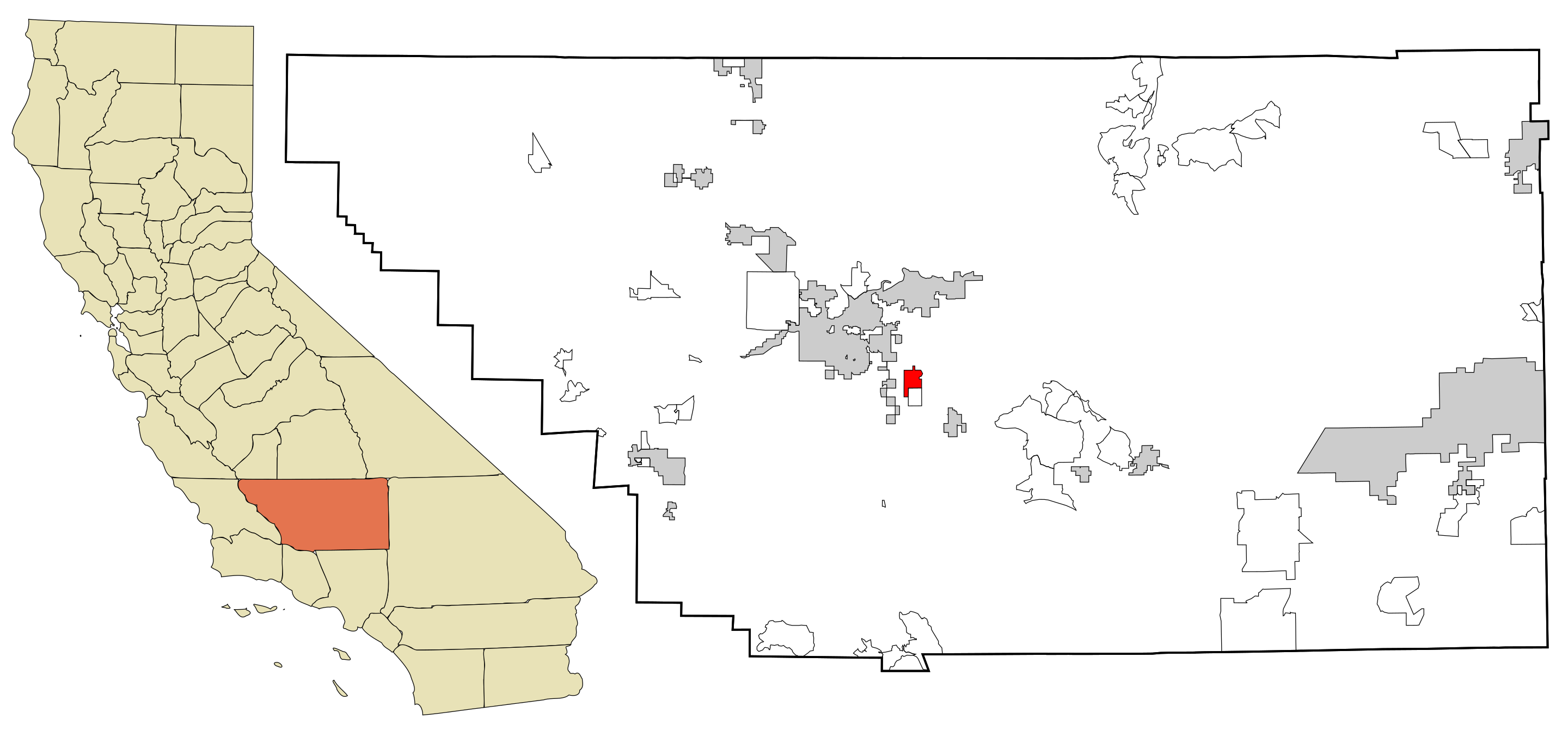
As of 2024, California had 220 failing drinking water systems serving nearly half a million people.
Lamont has received $25 million in Water Board funding to help fix their failing drinking water system, which included three wells exceeding the Maximum Contaminant Level of arsenic and 1,2,3-tricholoropropane.
Module 1: Identifying Injustice Recap
We found that people living in the city center are more likely to use public water, and that in Lamont, those people are more likely to be Hispanic in origin.
We also know from the linked press release that mitigation efforts in Lamont included the destruction of three 45-year-old wells that exceeded the state Maximum Contaminant Levels (MCL) for arsenic and 1,2,3-trichloropropane.
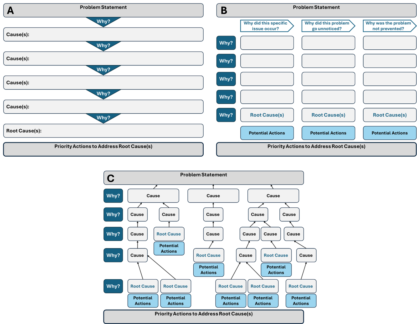
Root cause analysis
“Technique that helps identify the fundamental reasons, or root causes, of a problem or unwanted outcome”
A few considerations:
Your team should include community partners
Allocate enough time to be thoughtful and pursue leads
Honor hard truths!
Root cause analysis
Methods for interrogating the problem
What are the root causes of contamination and exposure to it?
Take 10 minutes to discuss the root causes of contaminated water and exposure to it in Lamont. Some questions to consider include:
How are people exposed to the contaminated water?
How did contaminants get into the water?
Why hadn’t contaminants been removed from the water?
One person from each group will share a summary of their group’s discussion when we reconvene.
How are people exposed to the contaminated water?
Public water use, which as we learned, is a function of where you live
Why do people live where they live?
Redlining
Tribal lands
Proximity to work
How did contaminants get into the water?
Age of wells
Concentration of agricultural activity
Why hadn’t contaminants been removed from the water?
Permitting
Cooperation
Limited resources
Scaling intervention
Where else is the mechanism at play?
SAFER has funded 15 water system consolidation projects in Kern County, where Lamont is located. That’s about 16 percent of SAFER-funded consolidations statewide.
Is there a common factor affecting water systems in Kern County that might also affect water systems in other counties?
🛎️ Chime in or share your ideas in the chat.
Where else is the mechanism at play?
Let’s focus on one of the mechanisms we suspect led to contamination: agricultural activity. If we can identify other places where agricultural activity occurs, then we might find other places where the water is contaminated.
What data might help us understand the relationship between agriculture and water system health?
🛎 Chime in or share your ideas in the chat.
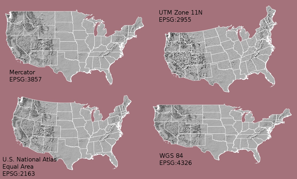
Mapping notes: Projections
Maps are flat, the earth is not
Projection determines how your mapping software translates the earth’s curvature into a flat map
Different projections won’t overlay cleanly
A lot of software, like R, will throw an error if you ask it to operate on map layers in different projections
Create geospatial version of SAFER data in Albers California projection
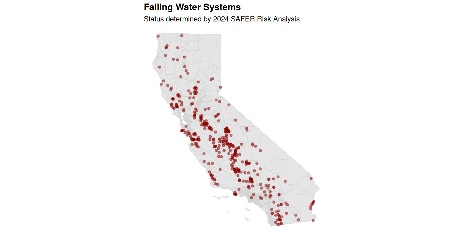
Failing water systems
Plot the location of failing water systems on a map.
safer_point_map <-ggplot() +1geom_sf(ces, color ="lightgray", mapping =aes()) +2geom_sf(safer_ra_as_sf %>%filter(CURRENT_FAILING =='Failing'), colour ="darkred", alpha =0.5, mapping =aes()) +labs(title ="Failing Water Systems", subtitle ="Status determined by 2024 SAFER Risk Analysis") + plotThemesafer_point_map
1
Add a tract base map
2
Add a point layer showing failing water systems
Failing water systems
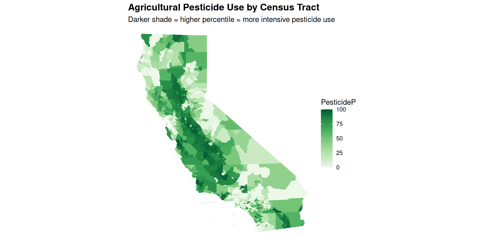
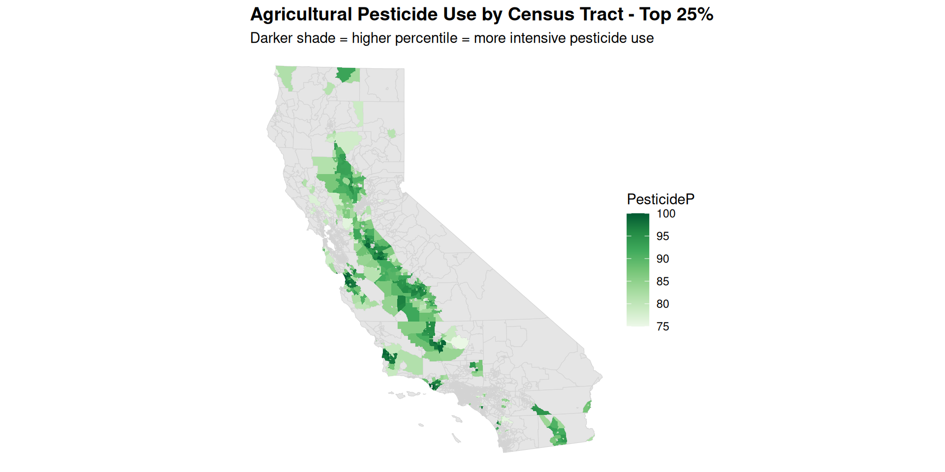
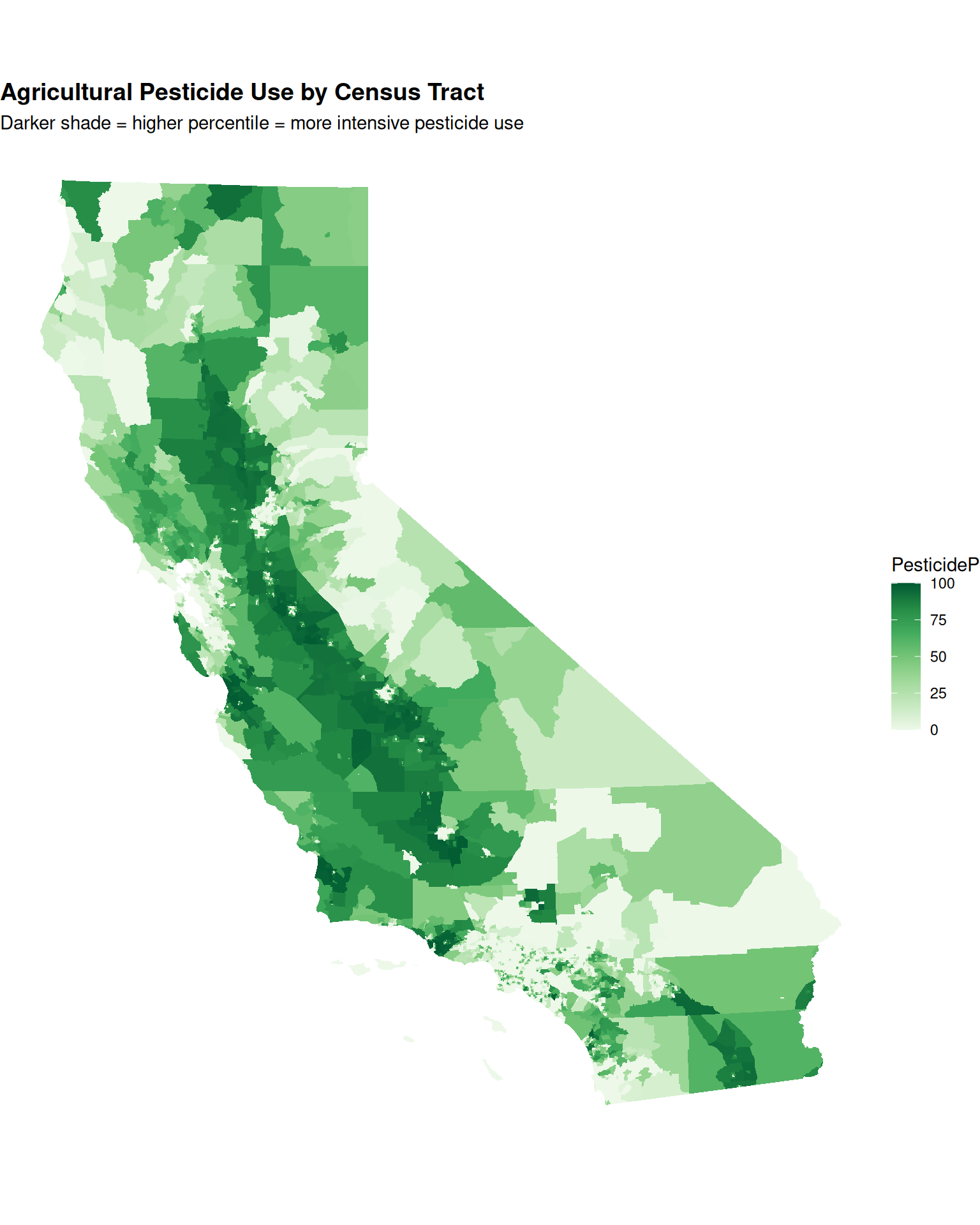
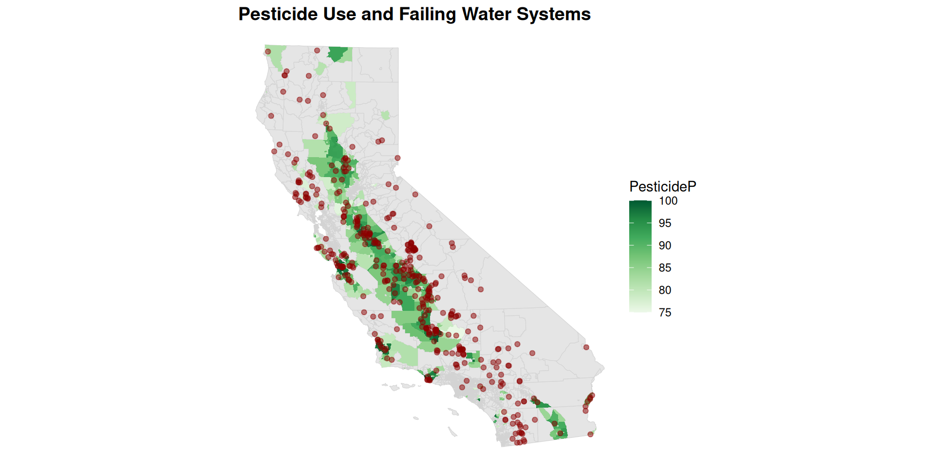
More pesticide use = more failing water systems?
Let’s overlay failing systems with pesticide use to see if we can identify a relationship.
ggplot() +geom_sf(ces, color ="lightgray", mapping =aes()) +geom_sf(ces %>%filter(PesticideP >=75), color ="white", linewidth =0.001,mapping =aes(fill = PesticideP)) +scale_fill_distiller(palette ="Greens",direction =1) +geom_sf(safer_ra_as_sf %>%filter(CURRENT_FAILING =="Failing"), colour ="darkred",alpha =0.5, mapping =aes()) +labs(title ="Pesticide Use and Failing Water Systems") + plotTheme
More pesticide use = more failing water systems?
More pesticide use = more failing water systems?
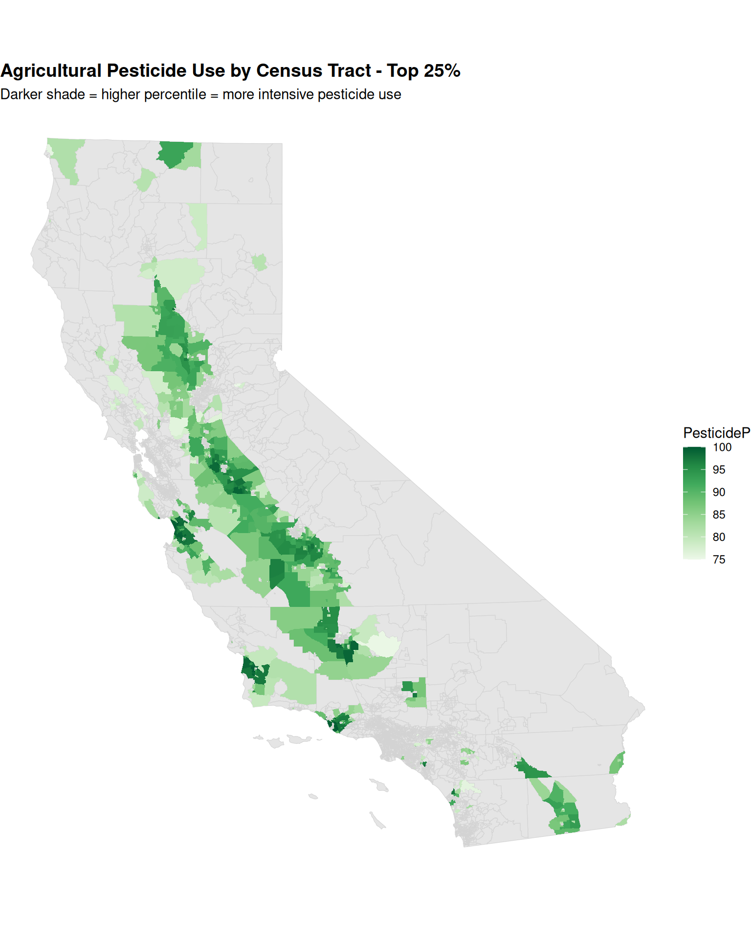
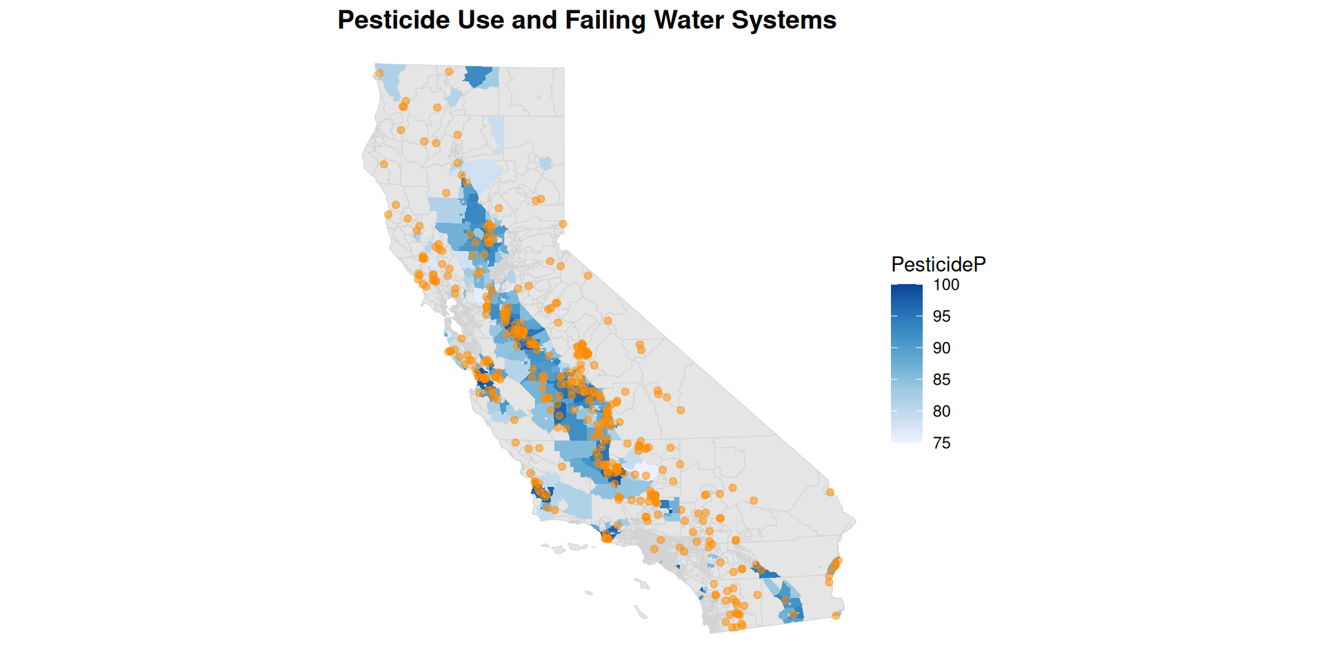
Yikes! Let’s make a version that’s color blind friendly.
ggplot() +geom_sf(ces, color ="lightgray", mapping =aes()) +geom_sf(ces %>%filter(PesticideP >=75), color ="white", linewidth =0.001,mapping =aes(fill = PesticideP)) +scale_fill_distiller(palette ="Blues",direction =1) +geom_sf(safer_ra_as_sf %>%filter(CURRENT_FAILING =="Failing"), colour ="darkorange",alpha =0.5, mapping =aes()) +labs(title ="Pesticide Use and Failing Water Systems") + plotTheme
More pesticide use = more failing water systems?
More pesticide use = more failing water systems?
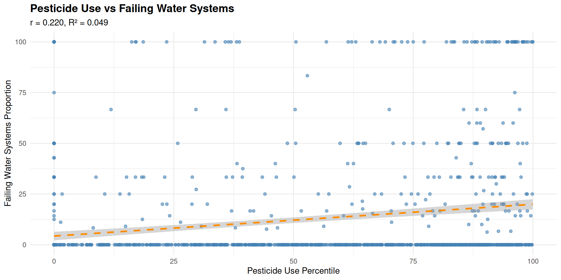
We can see a relationship, but how strong is it? Let’s do a quick statistical analysis to see whether there’s a significant relationship between pesticide use and failing water systems.
First, we need to aggregate the SAFER data by tract.
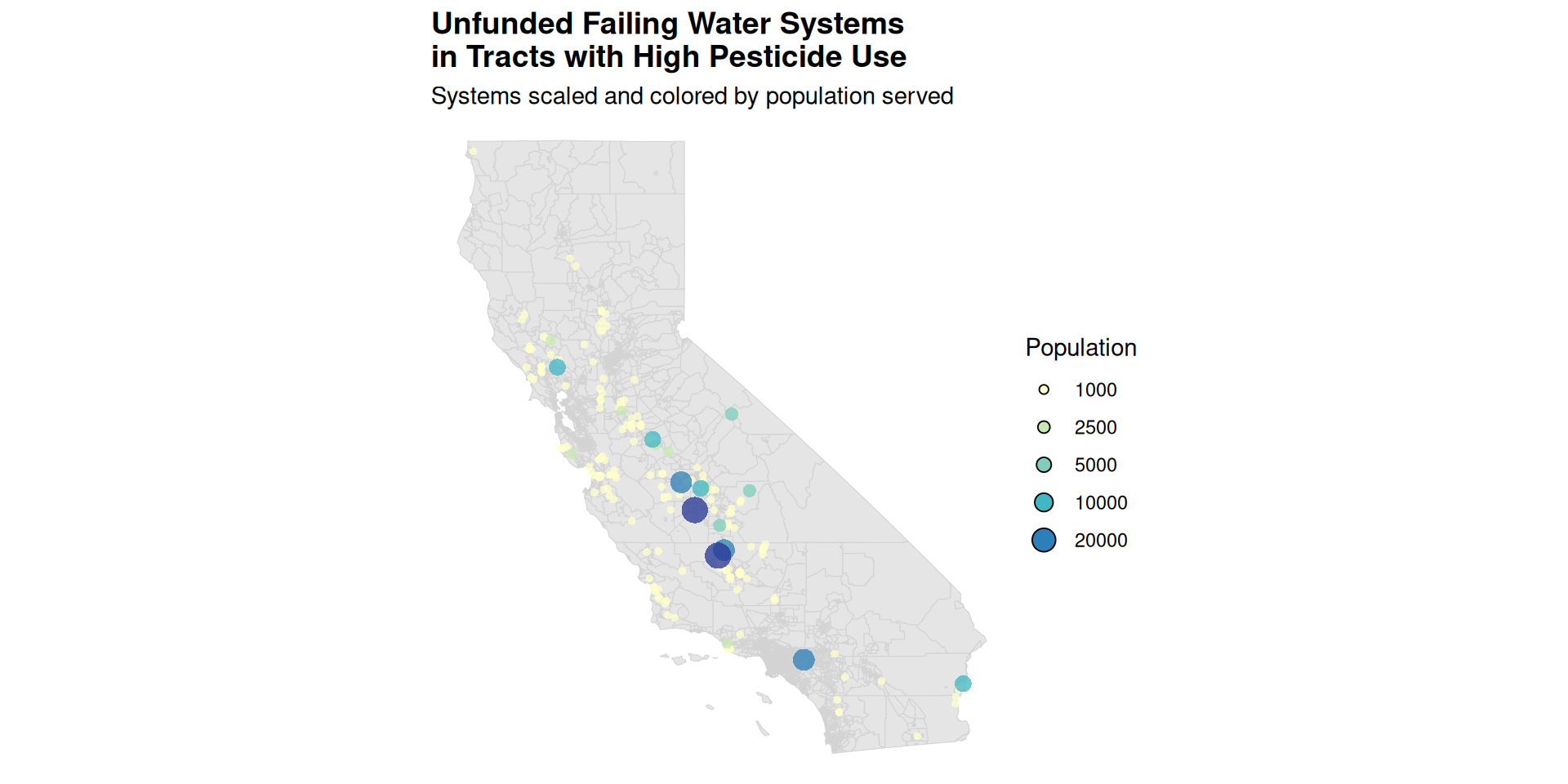
head(unfunded_failing_systems, n =5) %>%st_drop_geometry() %>%select(PL_ADDRESS_CITY_NAME, COUNTY) %>%rename(county = COUNTY, city = PL_ADDRESS_CITY_NAME) %>%pwalk(function(county, city) {cat("\n\n**Public Water Use In ", str_to_title(city),"(", str_to_title(county), " County)**\n\n")# Step 1: Retrieve census data place_blocks <-tryCatch({retrieve_census_data("CA", str_to_title(county),str_to_title(city)) }, error =function(e) {message("❌ Failed to retrieve census data for ", city, ", ", county, ": ", e$message)return(NULL) })if (is.null(place_blocks) ||nrow(place_blocks) ==0) {message("⚠️ No census data for ", city, ", ", county, ". Skipping.\n")return(NULL) }# Step 2: Join EPA data place_blocks_with_p_public_water <-tryCatch({join_epa_data(place_blocks) }, error =function(e) {message("❌ Failed to join EPA data for ", city,", ", county, ": ", e$message)return(NULL) })if (is.null(place_blocks_with_p_public_water) ||nrow(place_blocks_with_p_public_water) ==0) {message("⚠️ No matched EPA data for ", city,", ", county, ". Skipping.\n")return(NULL) }# Step 3: Summarize and print place_demographic_summary <-tryCatch({summarize_public_water_usage(place_blocks_with_p_public_water) }, error =function(e) {message("❌ Failed to summarize data for ", city,", ", county, ": ", e$message)return(NULL) })if (!is.null(place_demographic_summary)) {print(kable(place_demographic_summary)) } })